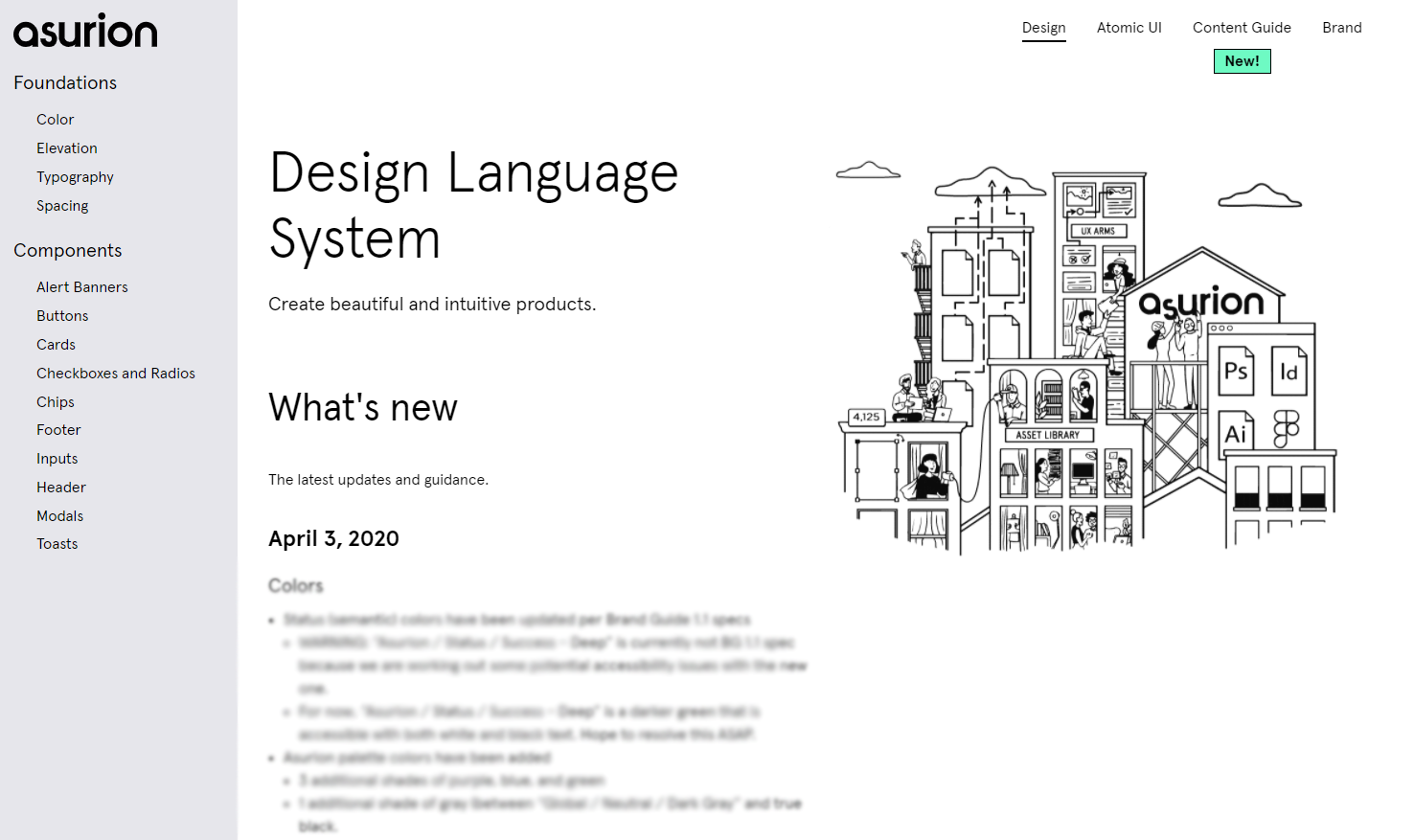
Asurion Design System
A global design language and system(s) to unify many disparate teams and products under one cohesive brand. Dozens of designers, engineers, and other product team members all over the world now use this system every day.
Contributions: research, visual design, design ops, Figma, frontend development, project management

Building the Foundation
Though my team was obviously not the first to attempt to create a design system for a team of diverse people (even within Asurion), every product-driven organization operates a little differently and each has its own quirks. In our case, a strong culture of engineering-driven decisionmaking meant that our design system had to both solve traditional design problems and help earn the design organization as a whole a seat at the table.
Fortunately, my design system team had multiple developers-turned-designer (myself included), which allowed us to heavily piggyback on existing DevOps strategies. Not only did this give us a solid foundation to solve design-specific challenges from, but it also granted us significant credibility with the engineering side of our organization.

Designed for Inclusivity
No website, app, or tool can get very far in today’s world without being easily accessible for every single possible user that could come across it. Given that, and frankly a history of hit-or-miss accessibility at Asurion, it was critical that our new Design System be built from the ground up with WCAG 2.1 as not only important but mandatory.
To this end, my team implemented a broad QA check for any and all new contributions to the Design System. In addition to meeting brand, code, interaction, and layout guidelines, every single component submitted must pass WCAG 2.1 double-A checks, and if they cannot pass triple-A checks an explanation is required as to why.
Our hope is that putting this burden on the Design System will alleviate the extra work from engineers and developers that often limits or blocks accessibility, and enable many more users to comfortable and easily use whatever our teams might build.

Figma For Everyone
Ultimately, the success of our system has been driven by the tools we adopted and created for our designers — none more impactful than the choice to use Figma to build out our component library (alongside ZeroHeight and Notion for detailed documentation).
Dozens and dozens of components were whiteboarded, tested, designed, and exported with Figma by my team, and it enabled us to leapfrog operational hurdles that we undoubtedly would have run into with a less-designer-friendly toolkit.